My portfolio!

The Recipe
Binder.

Project intro

I knew that I wanted to create a single page application using JavaScript, specifically React. This is something I have noticed that is in demand by employers and not a language I have used for any of my projects.

I decided on what the project was to be about by exploring all my interests and hobbies, I landed on cooking healthy meals. I revisited APIs to remind myself of how they work and what is the best option for this project.
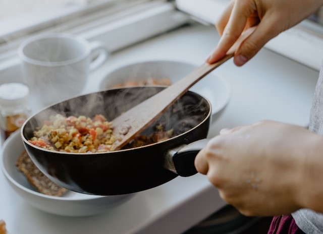
cooking picture

Initial research

I often want to try a new recipe or add a new ingredient to a meal but have to scroll through the internet before I can find anything which actually has a recipe on, the plan for this web app was to give you a recipe based on your direct search. After researching APIs I realised that there are other websites that use them to showcase huge food databases. Some of those can be found here.

To give a brief overview, an API is an 'Application Programming Interface'. It is how a software and application can communicate with the use of 'requests and responses'. API stands for Application Programming Interface. In the context of APIs, the word Application refers to any software with a distinct function. Interface can be thought of as a contract of service between two applications. This contract defines how the two communicate with each other using requests and responses. Their API documentation contains information on how developers are to structure those requests and responses. Using an API would be an industry standard and is the most logical way to achieve what I wanted and it is for that same reason that those sites earlier mentioned also use them.

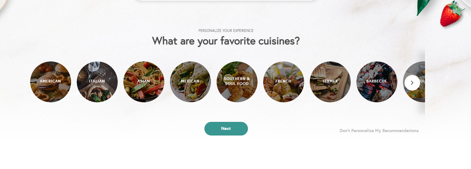
Although lots of the sites offer an extensive list of meal, they are already categorised assuming that the user has an idea of the type of cuisine they're looking to cook. As previously mentioned, if you are looking to try add a new food into your meal you may not know which category that would fall under. Alternatively, if you are craving something specific you do not need to search through cusinines or food groups. An example of this can be seen from Yummly in the image below. Many of these website have a lot of blog posts on too, meaning that the user will have to click through the page many times before potentially landing on the recipe they're looking for. The purpose of The Recipe Binder is to allow for a simple way for the user to input data and recieve the data they are looking for.

yummly food categories

Design research

My ideation process for the logo and web design actually started with an image. I searched for an image of someone cooking and found cover image on The Recipe Binder. I loved the image and thought it is perfect for the background image as it is obviously directly related to cooking but also is not too busy that it would prevent me from adding elements on top of it. As you can see it has a chilli on it, so that is how I decided on the icon logo idea. As this project is just a prototype I simply found a photo of a chilli online, then using Illustrator I edited it and modified it to create a personalised SVG.

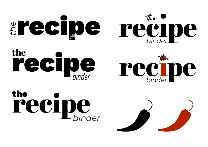
Personally, when creating a brand I like the variation that having both a icon logo and a text logo offers and with this is mind, I also created a text logo. This was done after the chilli so I used the same colour. I explored typefaces that I already knew I liked as well as new ones before choosing 'Abril Fatface', 'Montserrat Light' and 'Betterlet Regular'. You can the development of this logo on the board on the right.

logo board

Design research

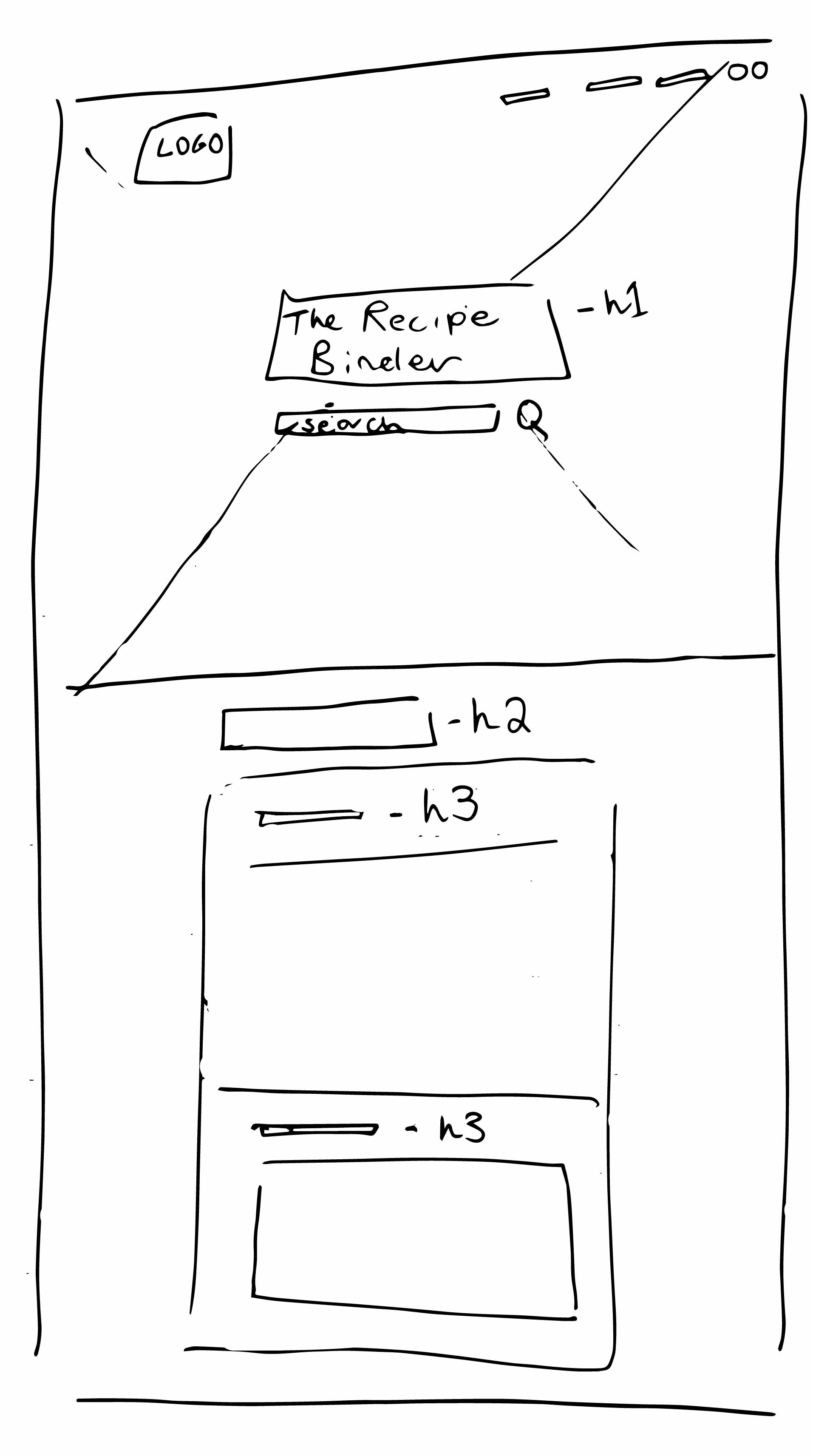
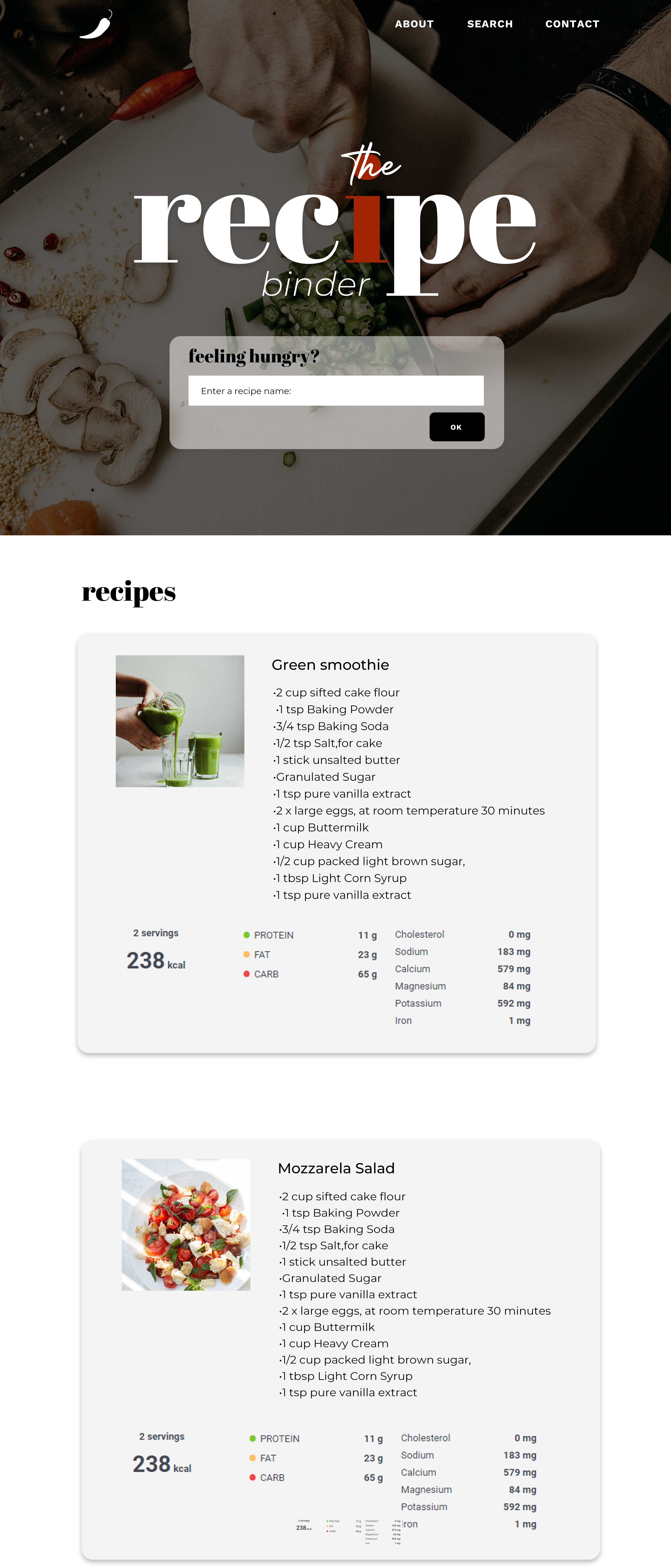
As you can see below are the first wireframes for the website design. The left being the hand-drawn and the right the digital. Before creating the final digital mockup, I went into Edamam and used it's search API demo so I could see the different ways my results could appear. To see an example of this click here. It was from I choose the layout seen in both wireframes. There are some discrepencies between the final prototype for The Recipe Binder and the mockup. One of these being the use of images in the search results, although it looks more pleasing from a design perspective, it isn't very accurate as not every meal created from the same results would look the same. In addition, the macros at the bottom of the results have not been included in the prototype. If I were to develop the prototype further, I would gather a larger amount of user feedback and see if this is something that they would prefer. There is also only one set of results on the prototype but this is because I needed to see if it works in the way I needed/wanted and now that I know it does, I would add more moving forward.

drawing wireframe
digital mockup

Sustainability

Building a web app using HTML and JavaScript allows for an easy way to create seamless and interactive user interfaces. It is also beneficial due to the fact that the code is processed client side, which essentially is a rendering technique that allows for a web browser to display the content of a website without waiting for the entire page to be downloaded from the server. React.js is now owned by Meta, who also own Facebook and Facebook continuously invest time and money into the maintenance/development of React, further suggesting it is a sustainable technology. In terms of long term sustainability, React.js has only been around since 2013 and has now been voted the second most used web framework amongst software developers worldwide.

Although this prototype does not yet solve Sustainability Goal 10, I believe that with further development it could have the potential to be useful in aiding this. One way in which poverty and inequality can be defined is by the levels of access to nutritional food in different countries. Another way in which it could be defined is by lack of education. If development of The Recipe Binder was continued, it could allow people to have a better understanding of what meals/ food groups are the best for their bodies in terms of health and illness prevention.

Developmentresearch

For this project, I chose to use a platform called Edamam. It is a cloud-based food database with very detailed documentation on how to use the APIs. I used a GET Request for this project as it allows me to post specific recipe information into my url. I used an API platform called Postman for my project. It is created for a simple process when using and integrating APIs - it has an aesthetic UI which helps with this. To help with the APIs in this project I used JSON Crack, a visualisation tool for JSON data.

HTML

HTML was used to create the main structure to create a working demo.

JavaScript

This project was built using JavaScript, specifically for its use of functions.

React.js

Specifically the JS framework React was used to build the interface for this project.

CSS

The styling for the web app was achieved using CSS.

Projectdevelopment

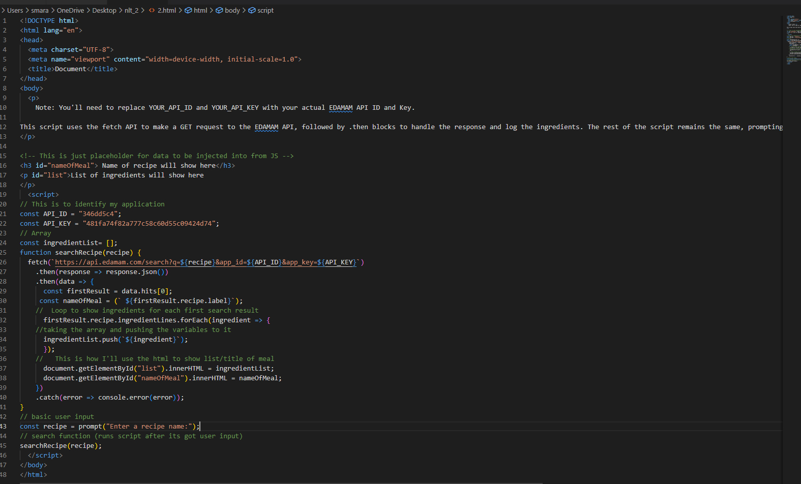
To view the script written to create the The Recipe Binder app demo, please click here. To create the first prototype I needed to understand what function takes JS code and turns in into HTML, how to create an array in JS as well as, how to push data to an array in JS. View my Development Bibliography to see the web resources used to educate myself.

The code below shows an unrefined working prototype of the recipe app, along with some comments explaining how it works:

working prototype code screenshot

To see how that first draft of the code appeared, please click here. By doing this the page took some structure and I had wire framed out exactly where the components were going to go.

working prototype code screenshot

I created a single page design as a base for what the application was to look like. I designed this with it’s functionality in mind but I knew that as the development progressed that I may need to amend the design slightly. My next steps on this project were to wireframe out the html elements to create the structure of the page. I wanted the build of this project to be quick and simple so I could focus of the functionality, it was for this reason that I used Bootstrap. I have used Bootstrap in previous projects and is something I have knowledge with. I looked at what how to add an input field using Bootstrap and then at implanting the JS ‘onclick’ button.

Before I linked the JavaScript, I had created a version of the prototype that had both the input field and the button but the result being shown was based on the last text entry. It was not showing results based on a new input from the user. To see what this looked like in the development stage, click here.

In order to run my existing script that I had already created the most basic working version on my demo, I needed to name that function. This can be seen here: ‘button onclick="searchRecipe()">Click me'. Next, I gave the input area an id of ‘search’. The screenshot below then shows the code saying it is going to look through the file for an element named ‘search’. In this case this is the user input area where my user is searching for a specific recipe. That text input is then injected into the URL searching the internet for recipes which match that input. You can see this here. From here my next task was to build out the HTML elements from my wireframe and style them using CSS.

initial frontend styling screenshot

Next, I created the React App to build out this project and take it from just HTML and CSS. I followed the documentation and carried out the following steps to achieve this: Set up react environment > then ran application > Following reacts documentation, I fetched data from random user generator API. I needed to make sure that the data was render so that it is browser readable. Then I used a React API function to pull the data from the test API. From there, I needed to make sure that data stream comes in as object that can be handled by React. I explored ways to add my API into a React application and export the components.

test like button screenshot

Once I had got the search element working with react, I built a React App using the CMD. As I had already made and styled the HTML how I wanted it to look, I researched how to add a React component to my existing HTML website.

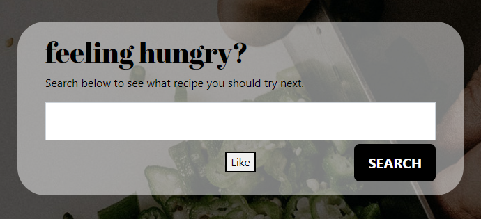
I tested out the following documentation from the link above and got a working React element in my HTML code, I created a ‘like’ button as seen in the screenshot below. decided to use this concept and try to add my search react element into my HTML.

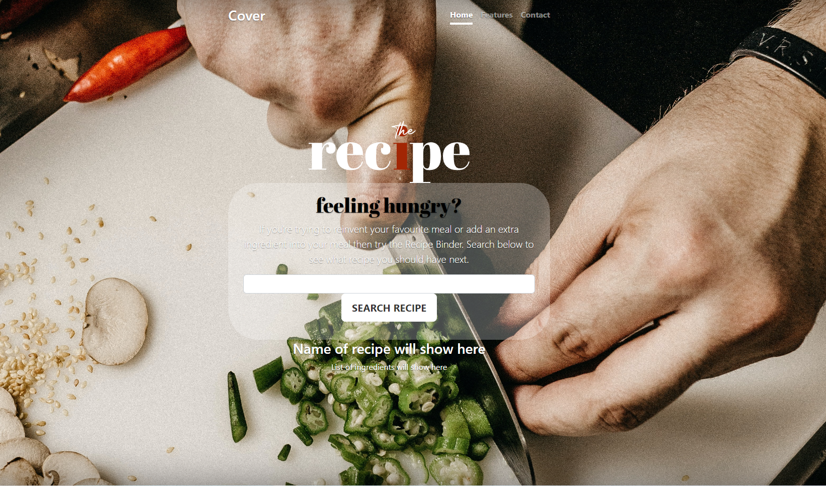
Before I completed this project, I explored refactoring code and why it is used among developers. It is a testing method that allows a developer to create the most efficient code. The way in which this will be done is by creating a solution you would like your code to overcome and creating a working code to achieve this. Next you would refine the code be removing any duplicate/ overly complex code. Then you would break it down into modular sections and improve each area. If you ran into an issue and the code stopped working, you would be able to go back to the last revision and figure out where the issue came from. By doing this, modular and making changes to improve performance / optimize resource usage. From there I combined the HTML from my prototype to the working react application. I used the same design but refined it slightly and it was overcomplicated before. To further develop this project, I considered accessibility for users. To see how I added accessibility features to this prototype, visit the Speech Recognition page on this portfolio.

User Feedback

I carried out user testing to ensure that this prototype worked effectively. The feedback received was positive as can be seen as follows:

Excellent website that is easy to navigate and functions perfectly allowing the user to explore various recipes at just the click of a button. Will certainly be using this website more in the future! 10/10

- John-Paul

Personal Evaluation

I loved combining my personal hobbies and interests into a project. It gives me even more motivation to complete every aspect of it to a high standard. I particularly found it interesting whilst I was researching similar applications, trying to problem solve and find solutions to make my project better for the user.

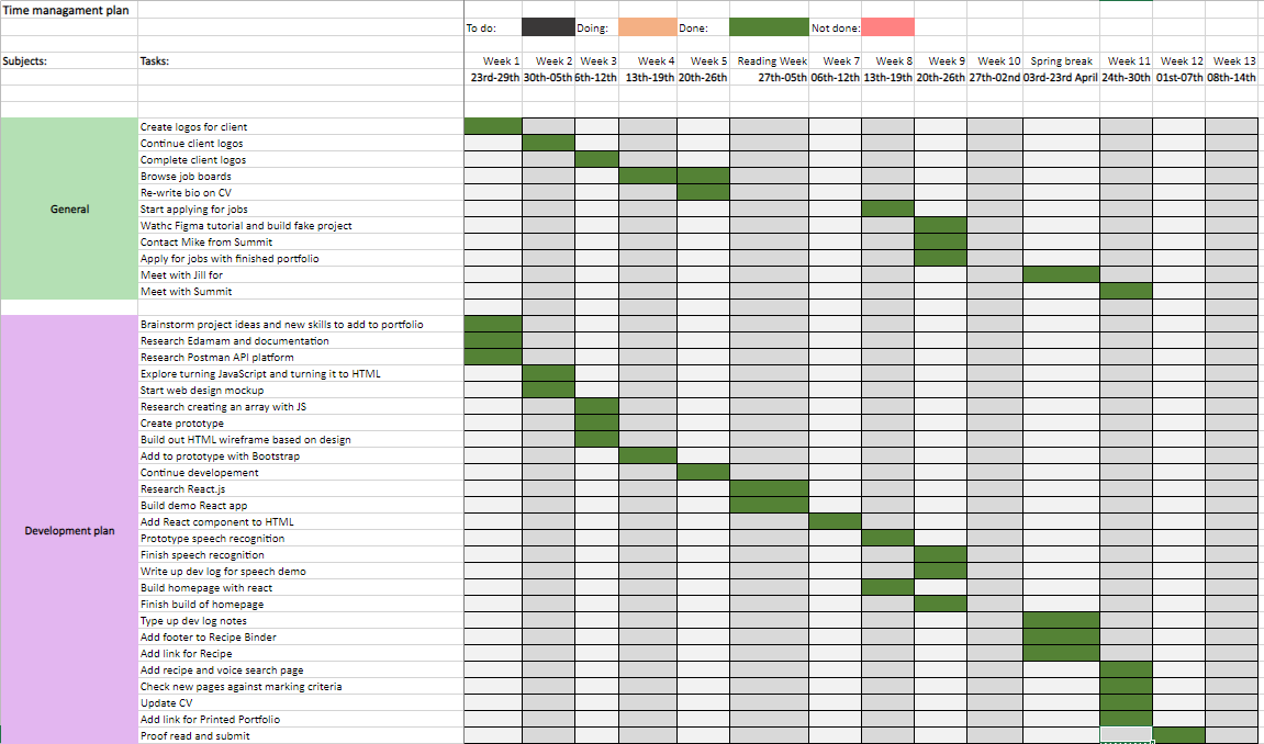
Time management

This project was really fun as it combined my hobby of cooking to a university project. It is something that I would use if I were stuck for meal ideas. In the future I would add more functionality to it by allowing the user to have different search categories such as macros or allergens.

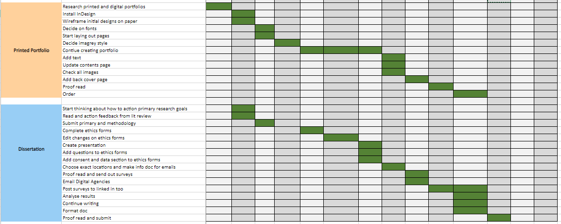
time management chart screenshot

​Please find attached my bibliography of the research content I used to create this project.