My portfolio!

More about
this Portfolio.

About this Portfolio

​After starting my second year with more development knowledge than I did starting my first year at university, I decided that now would be a good time to revamp and modernise my portfolio website – it is after all the first impression potential employers will receive of me. The reason I chose the pink monochrome colour scheme is because it is very 'in fashion' right now and in my opinion, very aesthetically pleasing. It also plays on the fact that the world of development is predominately male orientated, and I thought it is a fun way to represent femininity whilst not being over the top and being modern.

Heartbeat tap logo

HTML

HTML was used to create the main structure of my Portfolio website.

CSS

I used CSS to style my Portfolio and create an aesthetic I could move forward with.

PHP

I used PHP to aid with the build of this website, allowing me to reference certain pages avoiding any duplicated HTML.

Website updates

​I have 'revamped' my portfolio at the beginning on 2nd year but given I want to portray myself as a frontend developer who is interest in design, I think it is crucial for my website to be solid and have a clear representation of who I am and what I can offer. I will be using existing elements, with new style and updated framework.
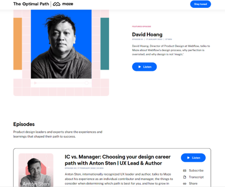
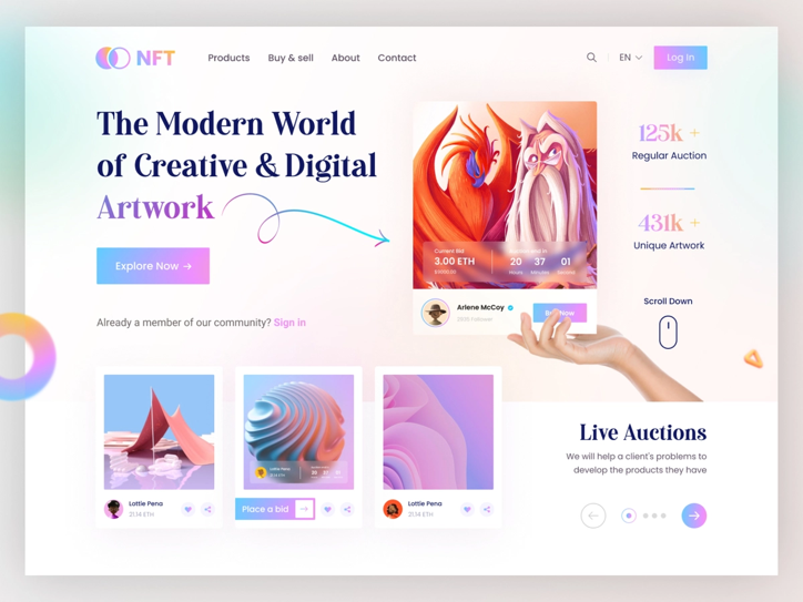
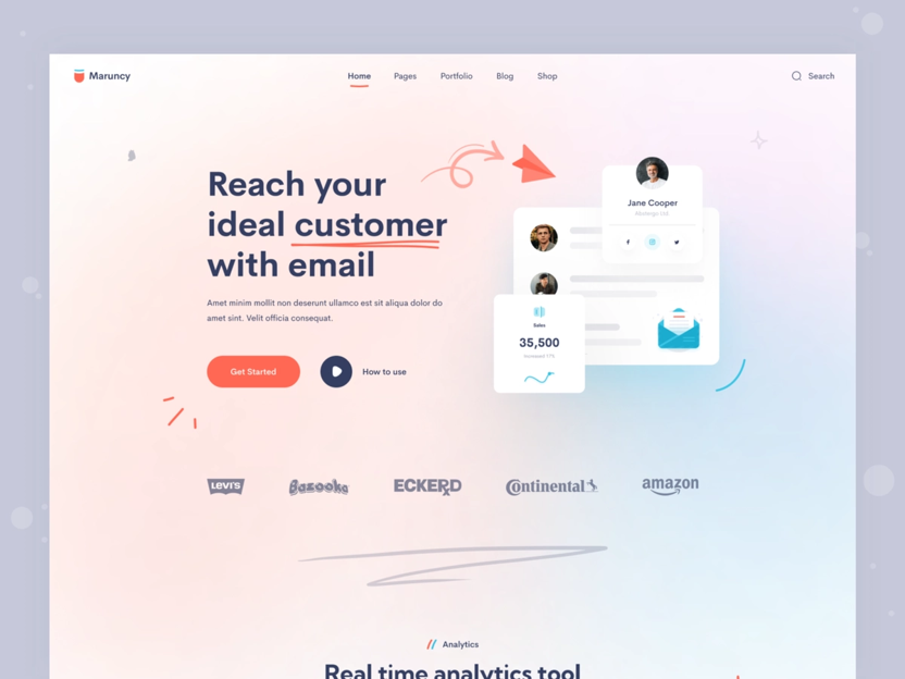
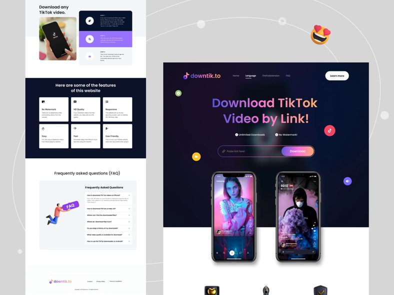
To get inspiration for styles of websites that I like, I search for 'portfolio websites' on Dribbble.

flow diagram
flow diagram
flow diagram
flow diagram

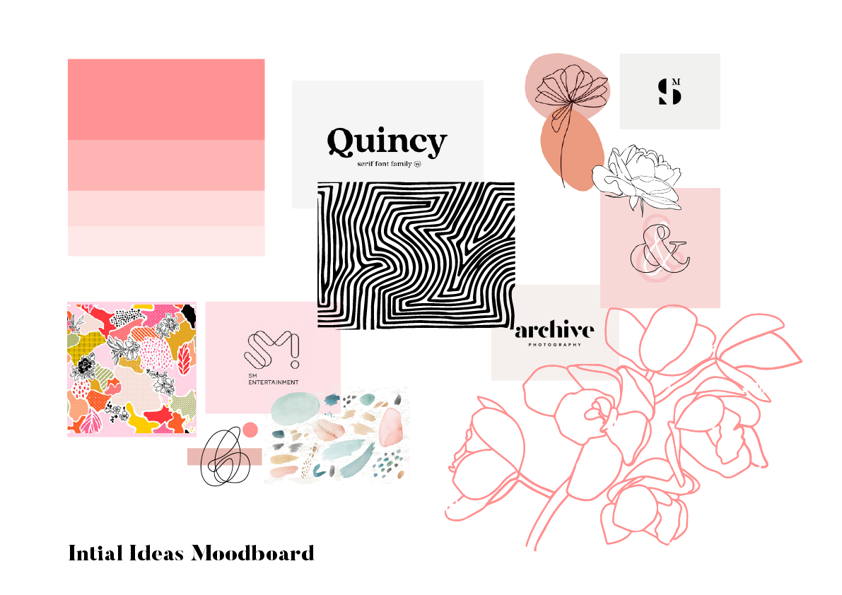
Whilst finding inspiration for a new design for my portfolio website, I realised that my new colour palette is not a clear reflection of me and how I would like to portray myself. I decided to use a similar colour palette to my updated website from Year 2, Semester 2 with the blue to pink gradient.

In hindsight I should have made my new portfolio mockup whilst creating my new logo for the social media campaign as since then I have made a lot of changes. Those changes being; I am no longer using the loose floral illustrations and the colour scheme has been reverted back to the one used on my portfolio from semester two, just slightly brighter. I feel as though these changes were the right thing to do to make a more modern and creative website. Although it took me longer than I had hoped for I ended up with a very in-depth ideation process and now feel confident the way I am representing myself to potential employers. Additional to the homepage, I created a mockup for the about page. I found this really useful when keeping consistent styling for the child pages. Both mockups acted as a guideline and I have since made more design choices that I feel improve the appearance.

Starting new

To tie my portfolio and my social media together I update the ‘line-break’ posts to match the cleaner, less cluttered style I am going for.

You can see these here, however the screenshot is to track my development, I now have the top row of gradient squares only. As my knowledge improved from looking at successful people’s social medias, I knew that text heavier descriptions with emojis and lots of hashtags gain more attention so I have updated the description section too.

To see I kept consistency between my portfolio visit my Social Media page using the button below.

Progress

​When submitting my portfolio website in my first year of university, I created numerous issues for myself by not sufficiently developing a website structure whilst building each page. This year I have correctly structured my files so when linking pages and images they are ordered and appear correctly. This also helped with the front-end page structure and my site map. It meant that when you are on each page, you can clearly see in the url exactly where the user is on the website.

The snippet of code below explains how I used PHP to reference specific elements and pages quickly and efficiently without the need for duplication.

Heartbeat tap logo

​To create an easier and less time-consuming process whilst creating my new portfolio website I used Bootstrap to develop and build it. Bootstrap is an industry standard and learning how to navigate it's features will be beneficial for my future in development. Bootstrap is a nearly fully-responsive system, the only edits needed was where I had hard coded custom elements to override Bootstrap's styling. I 'sanity checked' the responsiveness of my portfolio website, in doing so I changed the background colour on both the mobile screen and the ipad screen, this meant that I could be sure I was targeting the correct responsive size within each media query. Altogether I found creating a responsive website much easier in comparison to my first year at university as my website development knowledge has increased.

projector

Tips and tricks

For the build of all my projects in my second semester, I started using Visual Studio code editor. This was hugely beneficial as I found of so many extensions that were free and well known.